CLIENT:Kondo Solutions
SERVICES:Brand Design
The Idea
Kondo Solutions required a brand identity designed to support growth and diversification. The brand needed to establish a strong foundation while remaining flexible enough to expand alongside future products and services under the Kondo umbrella, including its first offering, Kondo Bookkeeper.
The Concept
The concept centered on creating a brand identity that is both timeless and adaptable. The mark needed to be simple enough to remain relevant over time while distinctive enough to create a strong first impression.
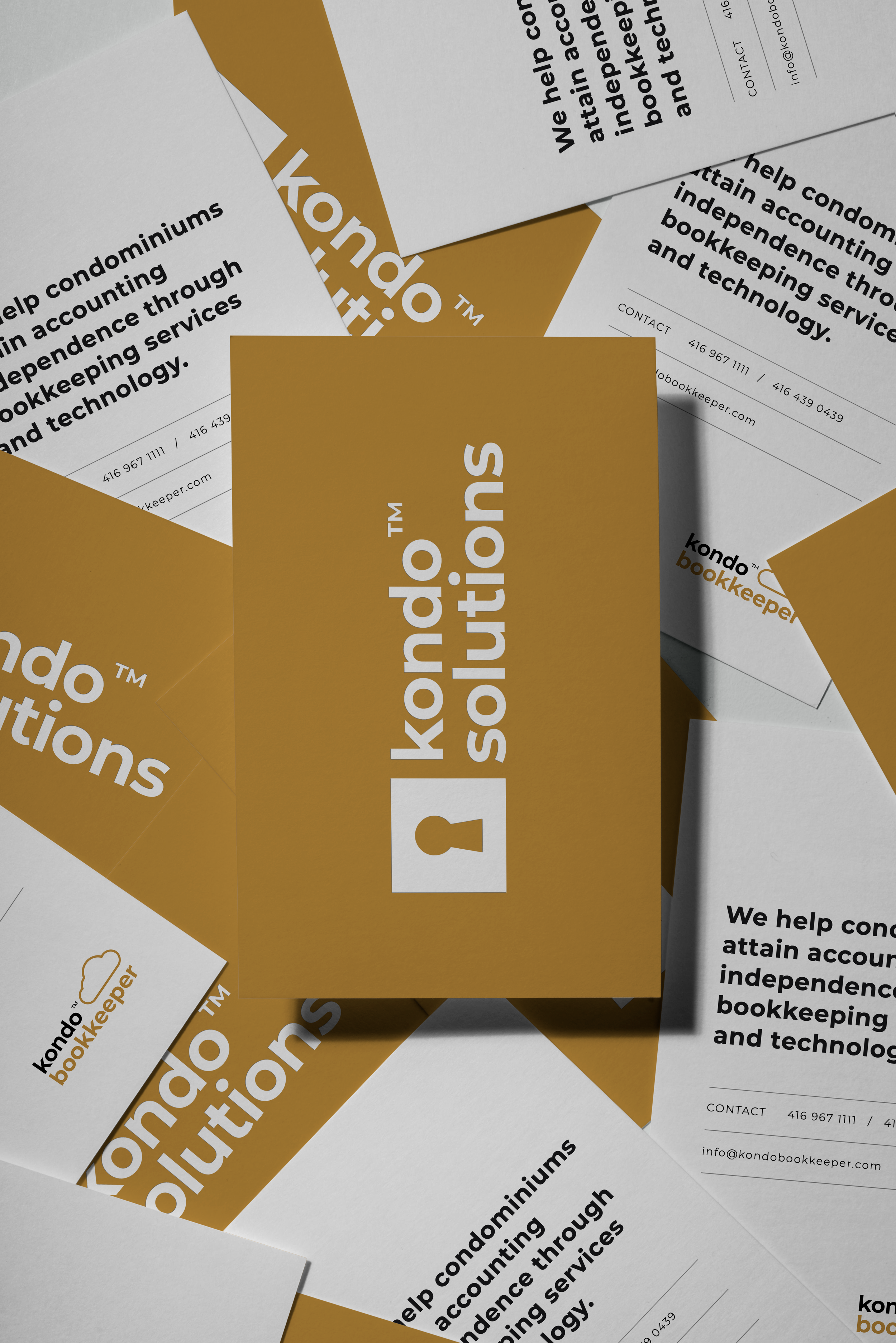
The identity was designed to stand confidently in a competitive market while allowing sub-brands, such as Kondo Bookkeeper, to remain clearly connected to the Kondo Solutions brand. The visual language emphasizes stability and reliability — qualities essential for a company operating in the management and accounting space.
The Design
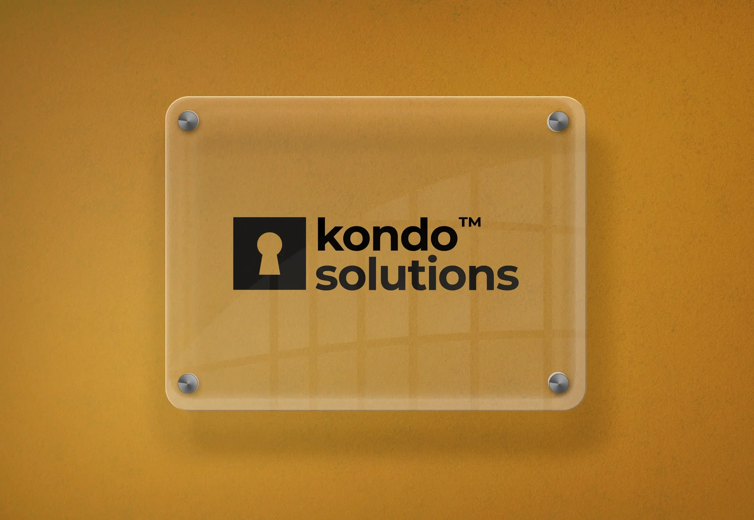
The primary logo features a sleek, modern wordmark designed to reflect the innovative nature of Kondo Solutions. A bold typeface paired with a warm, approachable yet authoritative colour palette establishes a balance between professionalism and accessibility.
At the centre of the visual identity is a keyhole symbol representing security and trust — essential qualities in the property management and accounting industry. The square surrounding the keyhole reinforces ideas of structure, organization, and reliability.
A secondary logo was developed for the company’s first product, Kondo Bookkeeper, maintaining the core visual language of the Kondo Solutions brand. This continuity ensures that while Kondo Bookkeeper stands as its own product, it remains clearly connected to the broader Kondo ecosystem.
The cloud element within the mark subtly references the platform’s cloud-based functionality, signalling both innovation and accessibility.
The project was later featured in DesignRush’s Best Professional Services Logo Designs of 2025.